Before you raise your ad budget, fix the page your ads point to. Seven practical landing page changes, in the order we check them during a teardown.
 By Jordan Blake · CRO and Web Lead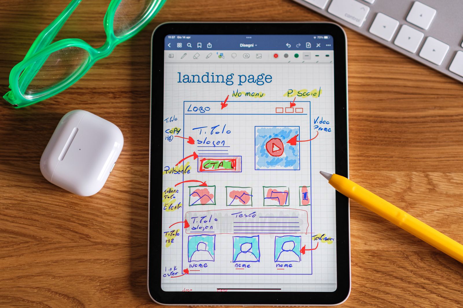
Key takeaways
- Improving a landing page lowers cost per lead on traffic you are already paying for.
- The headline should repeat the promise of the ad, and the page should ask for one action only.
- Shorter forms, proof beside the button, and a fast, thumb-friendly mobile layout remove the most common blockers.
- Fix what is plainly broken first, then test the offer and headline before small details like button color.
Before you raise an ad budget, look at the page the ads point to. In our sample accounts, the landing page is usually where the cheapest gains are hiding, because every improvement applies to traffic you are already paying for.
For example, say you spend $4,000 a month to send 2,000 visitors to a page that converts 4 percent of them. That is 80 leads at $50 each. Move the page to 5 percent and you have 100 leads at $40 each, for the same spend. These are the seven fixes we check first in a teardown. None requires a redesign. Most can be done in a week.
Fixes 1 and 2: get the promise right
1. Match the message to the ad
If the ad says "same-day AC repair in Denver" and the page headline says "Welcome to our family of home comfort solutions," the visitor has to work to confirm they are in the right place. Many will not bother. Repeat the core promise of the ad in the headline, in close to the same words. If you run five ad groups for five services, you need five headlines, and often five pages.
2. Give the page one goal
A landing page is not a homepage. Remove the main navigation, the blog links, and the social icons. Choose one action, such as booking a call or requesting a quote, and make every button point to it. A second option is fine when it serves the same goal, like a phone number beside a form. A newsletter signup competing with a quote request is not.
Fixes 3 and 4: make the yes easy
3. Cut the form to what you need
Every field is a small cost. Ask only for what you need to make the first contact: usually name, phone or email, and one qualifying question. Budget, address, and how they heard about you can wait for the call. If sales insists on more detail, try a two-step form that asks the easy question first.
4. Put proof next to the button
Testimonials buried at the bottom of the page do little for someone hesitating at the form. Move one specific piece of proof to within a thumb's width of the call to action.
- A short customer quote that names the result and the service.
- Your review rating and review count, kept current.
- A license, certification, or warranty stated in plain words.
- What happens after they submit, such as a call back within one business hour.
Fixes 5 and 6: fix the phone experience
5. Make it fast
Most paid traffic for local and consumer businesses arrives on a phone, often on a weak connection. Compress images, drop the autoplay video, and remove scripts you no longer use. A good working target is for the main content to appear in under 2.5 seconds on a mid-range phone. Test on your own phone with the wifi off, not on the office desktop.
6. Design for the thumb
Open the page on a phone and hold it in one hand. Can you reach the main button without shifting your grip? Is the phone number a tap-to-call link? Are buttons at least 44 pixels tall with space around them? Does the keyboard switch to a number pad for the phone field? A sticky call or book button at the bottom of the screen is often the most useful mobile change you can make.
Fix 7: test in the right order
Not every change deserves a test, and not every page has enough traffic for one. Fix what is plainly broken first, then test the things that are a matter of judgment, starting with the biggest.
- The offer: what the visitor gets and what it costs them.
- The headline and opening image.
- Form length and layout.
- Proof and where it sits.
- Button copy and color, last.
What to do this week
Pick your highest-spend landing page and run this short pass.
- Read your top ad and your page headline side by side. Do they make the same promise?
- Count the links that lead away from the page, and remove them.
- Count the form fields, and cut any you do not use on the first call.
- Load the page on your phone over cellular data and time it.
Record your conversion rate before you change anything, so you can tell what the work was worth. Some fixes will move the number and some will not. That is normal, and it is why the baseline matters.
Figures in this article are illustrative examples, not client results or published research.
Next up

How much should a small business spend on ads?
Stop guessing at an ad budget. Work backwards from a revenue goal to the leads you need, what each lead may cost, and a monthly number you can defend.

The local SEO checklist we run for every service business
The unglamorous local SEO work that helps service businesses compete in the map pack: profile listing, area pages, reviews, citations, and call tracking.

ROAS looks great. Are you actually making money?
A strong ROAS can still lose money. Here is how to find your break-even ROAS, read blended versus platform numbers, and put profit at the top of the report.